MySubaru Experience Redesign
Embeddd as a Senior Product Designer at Subaru of America, I have mainly accomplished two tasks - User onboarding and retention through experience redesign. This case is a continuation of the MySubaru onboarding, tackling the issues of user retention and engagement. The scope of this project is the entire MySubaru App Experience redesign, starting from homepage and its information architecture. This case also documents visual elements that I originated and contributed to the design system and components library.
Project Positioning
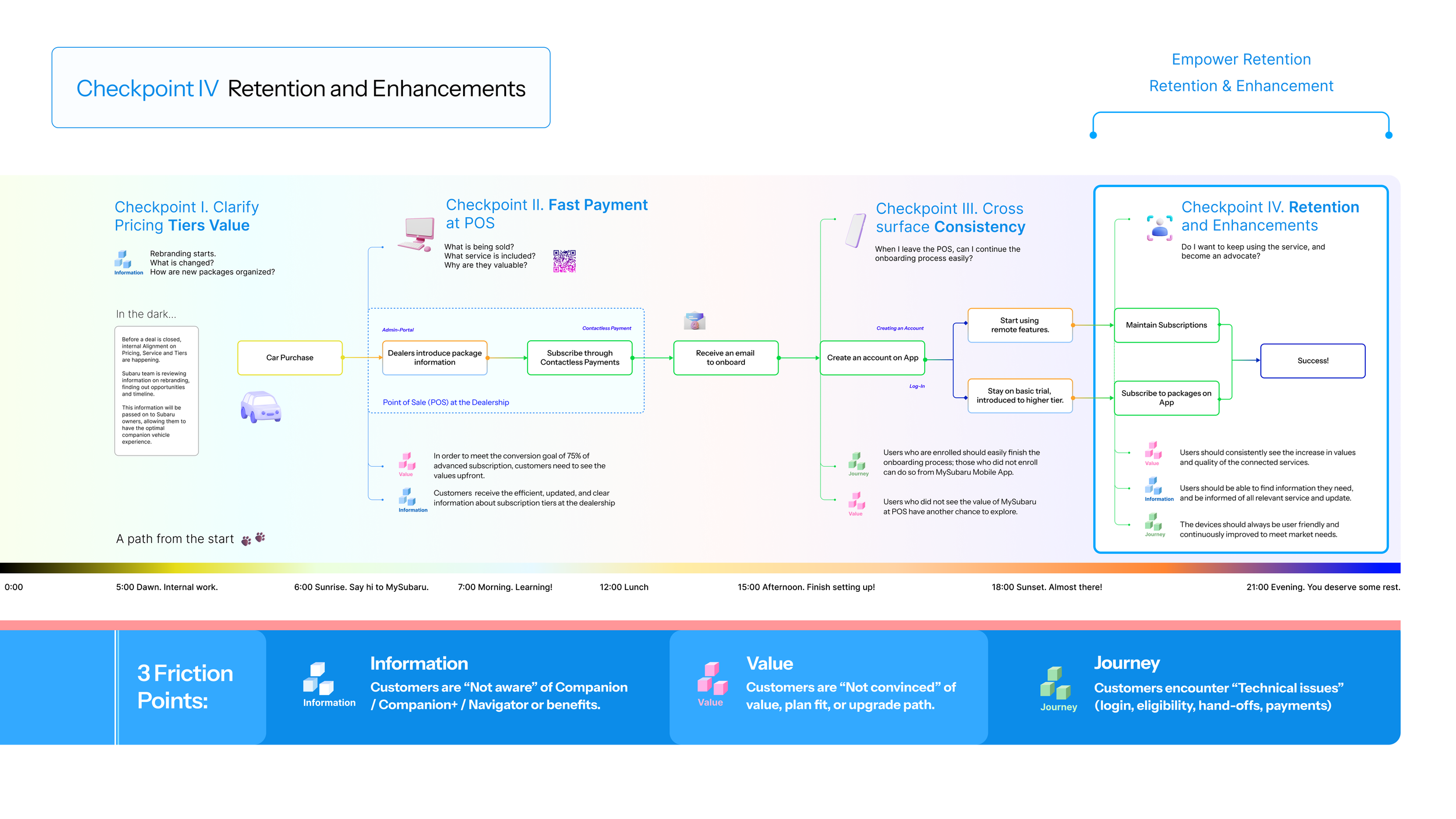
The following diagnostics map covers user onboarding (Checkpoint I - III), and retention (Checkpoint IV). It covers the entire journey from when a customer purchases a Subaru to when they successfully subscribe and engage with the MySubaru Service. Here, we exclusively focuses on the final checkpoints. Previous checkpoints and rationale that led to the creation of this map can be found on the Subaru Onboarding case.
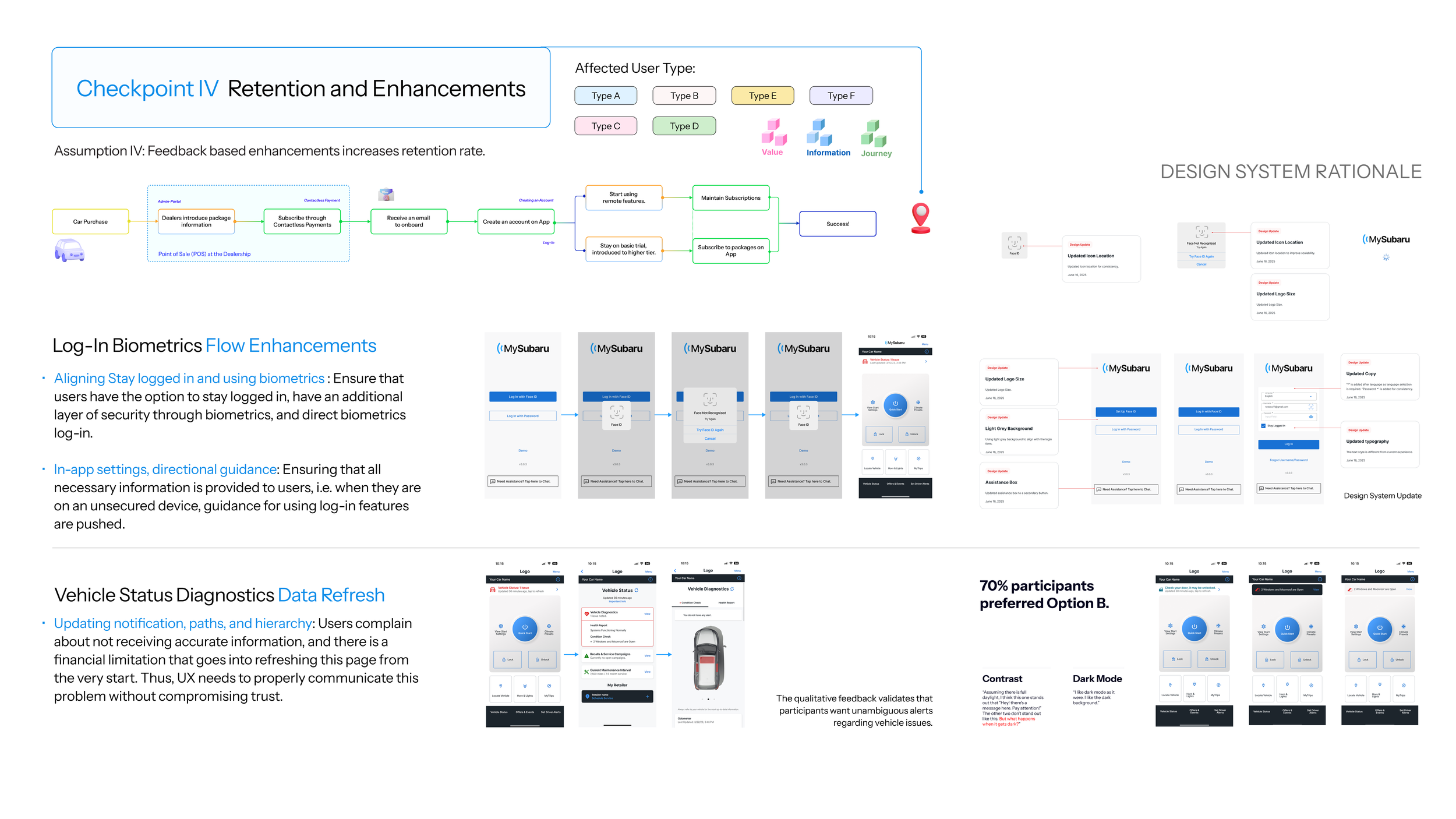
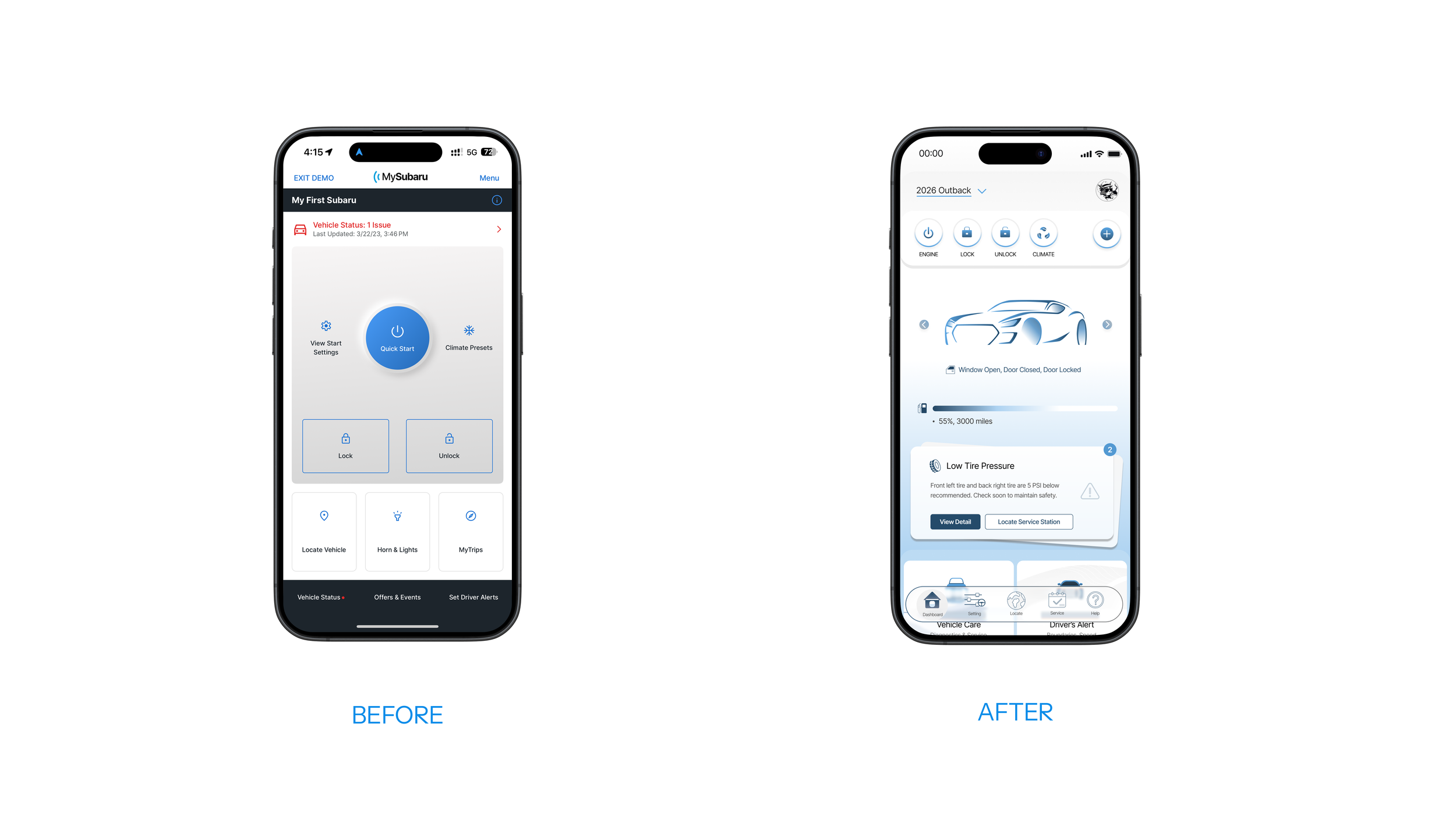
We started this with dealing with two immediate user feedback. The first one is fixing log-in and biometrics flow, which was a dev feedback that we tackled quickly and immediately. The second one has to do with checking the vehicle status. On the current version, users cannot see the vehicle status on the homepage.
User Research and Discovery
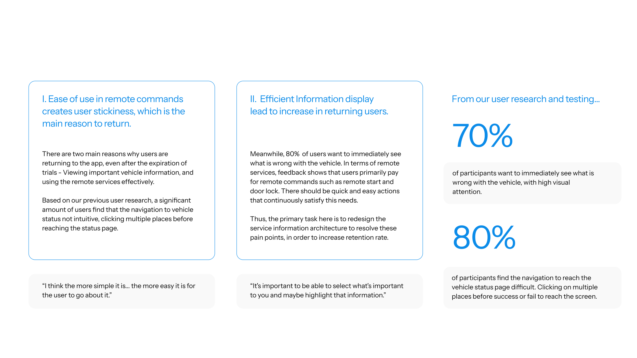
Starting at adressing key user feedback on Log-In enhancements and Data Refresh, we discovered key painpoints on navigation and information architecture. In order to solve the problem drastically, we initiated the experience redesign project, expanded the scope, and conducted user research and testings on IA. The result points us to two key issues: Usage of Remote Commands, and Learning about Vehicle Conditions.
Two Key Questions
What do “I” want on my key?
What do “I” want to see?
The two key questions lead us to the two user’s side challenges. They can be addressed by redesigning how users engage with remote commands, and the visualization and interaction with a real-time illustrative vehicle. In addition, we encountered with a challenge on the engineering side: Due to the complication in vehicle data transitions, each time the app fetches new data, it requires significant cost. The solution to this issue is to simplify user flow, with the most accurate and upfront information possible.
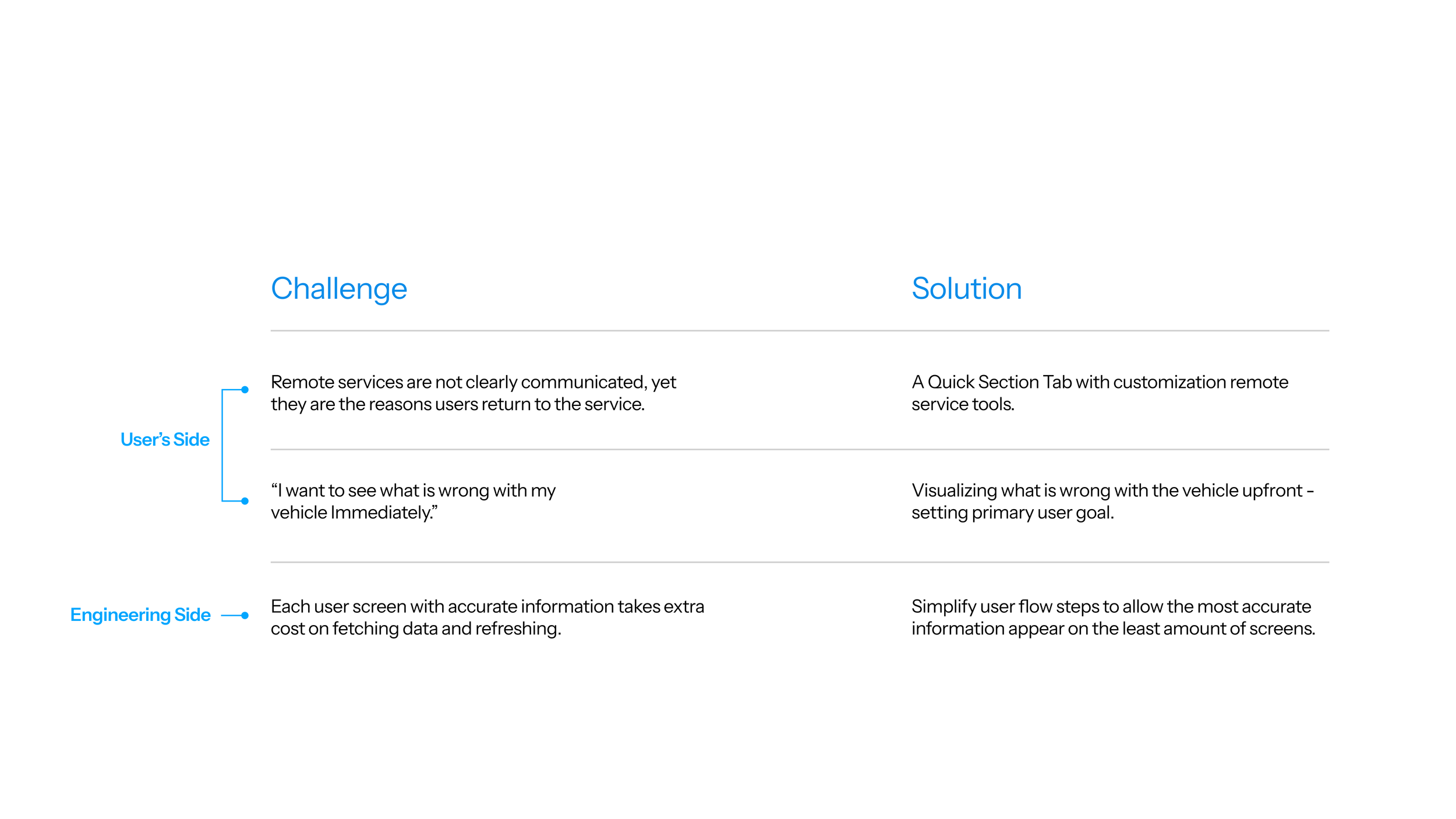
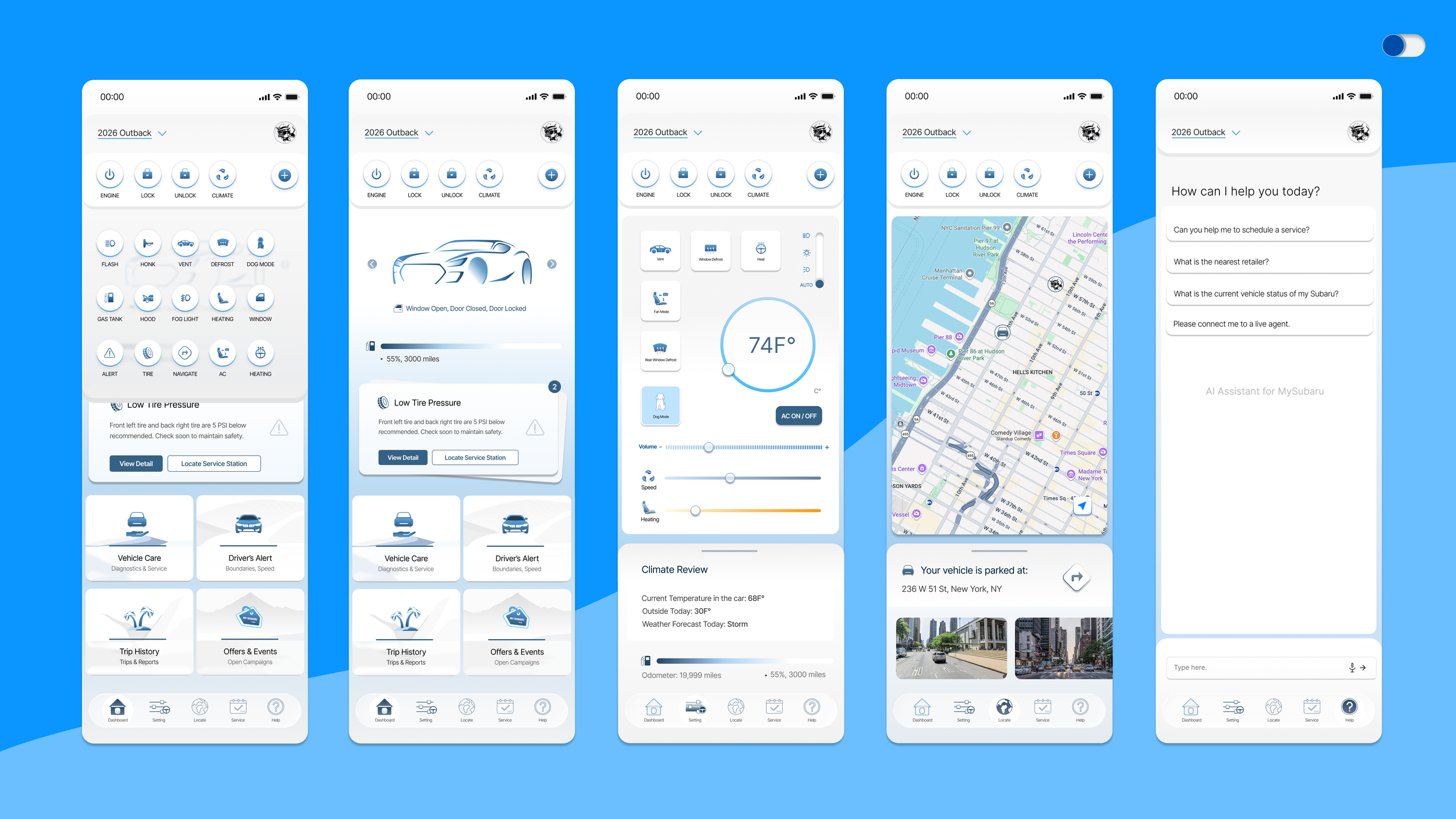
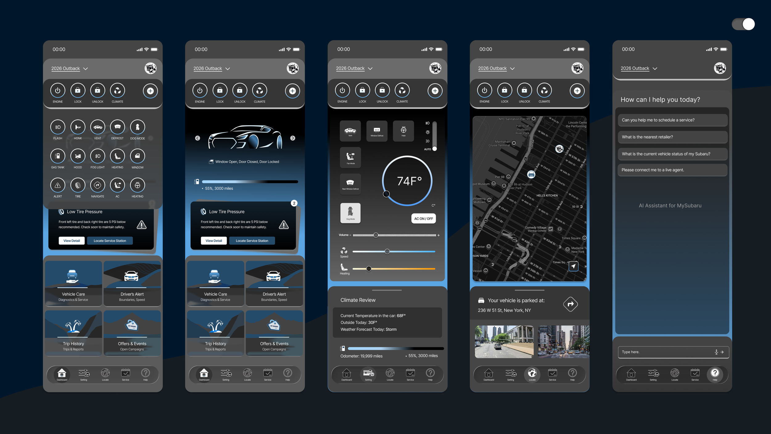
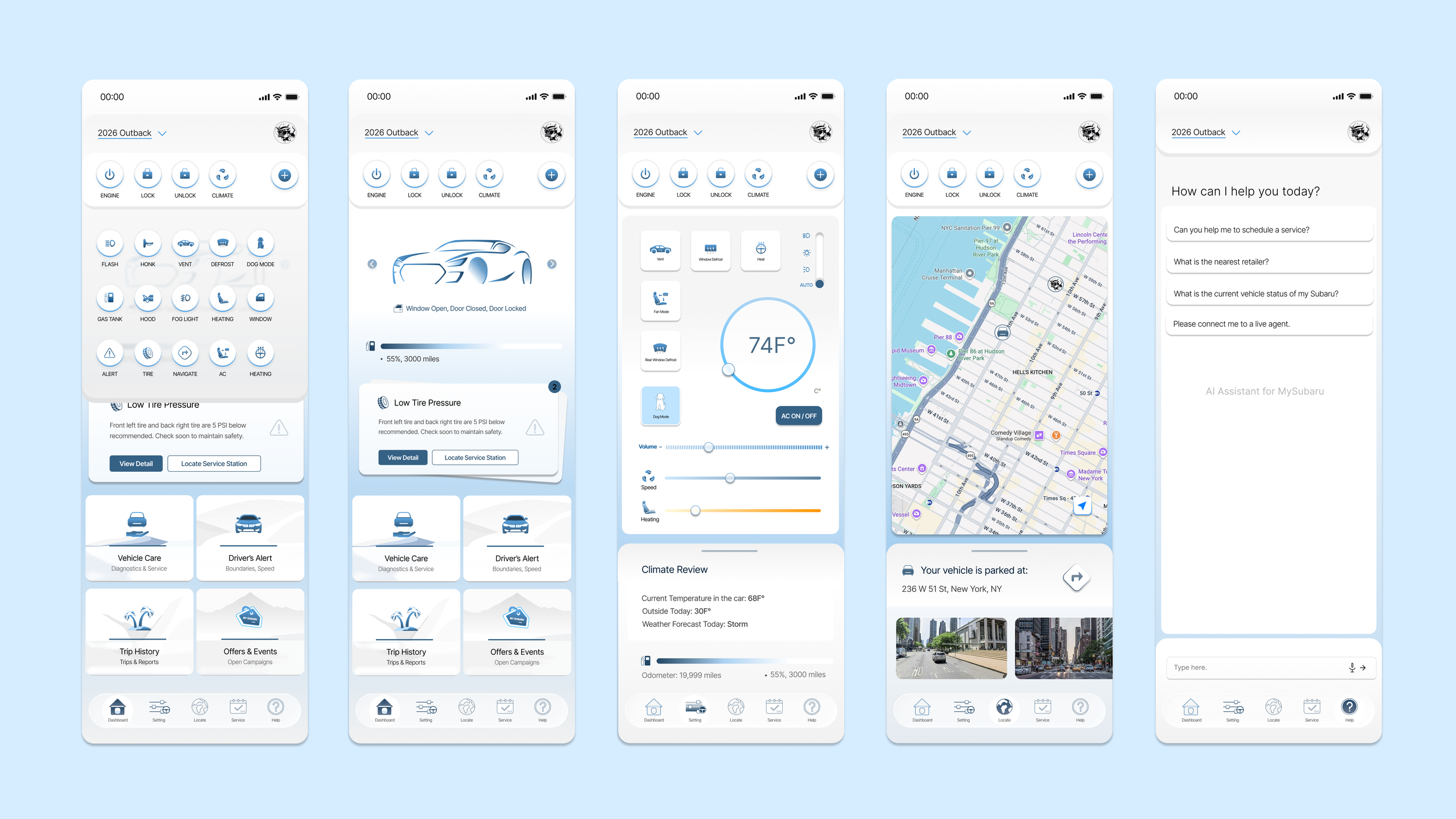
After preliminary iterations on IA and taxonomy, I came up with the homepage solution. The before and after comparison below highlights the changes. Before, only three commands are available, no immediate vehicle information is in display, and multiple steps are required to navigate to view vehicle status.
On my new solution, vehicle condition and alert cards are adopted, with a expandable, fixed quick action tab that stay there for commands access and a bottom nav to simplify user flow.
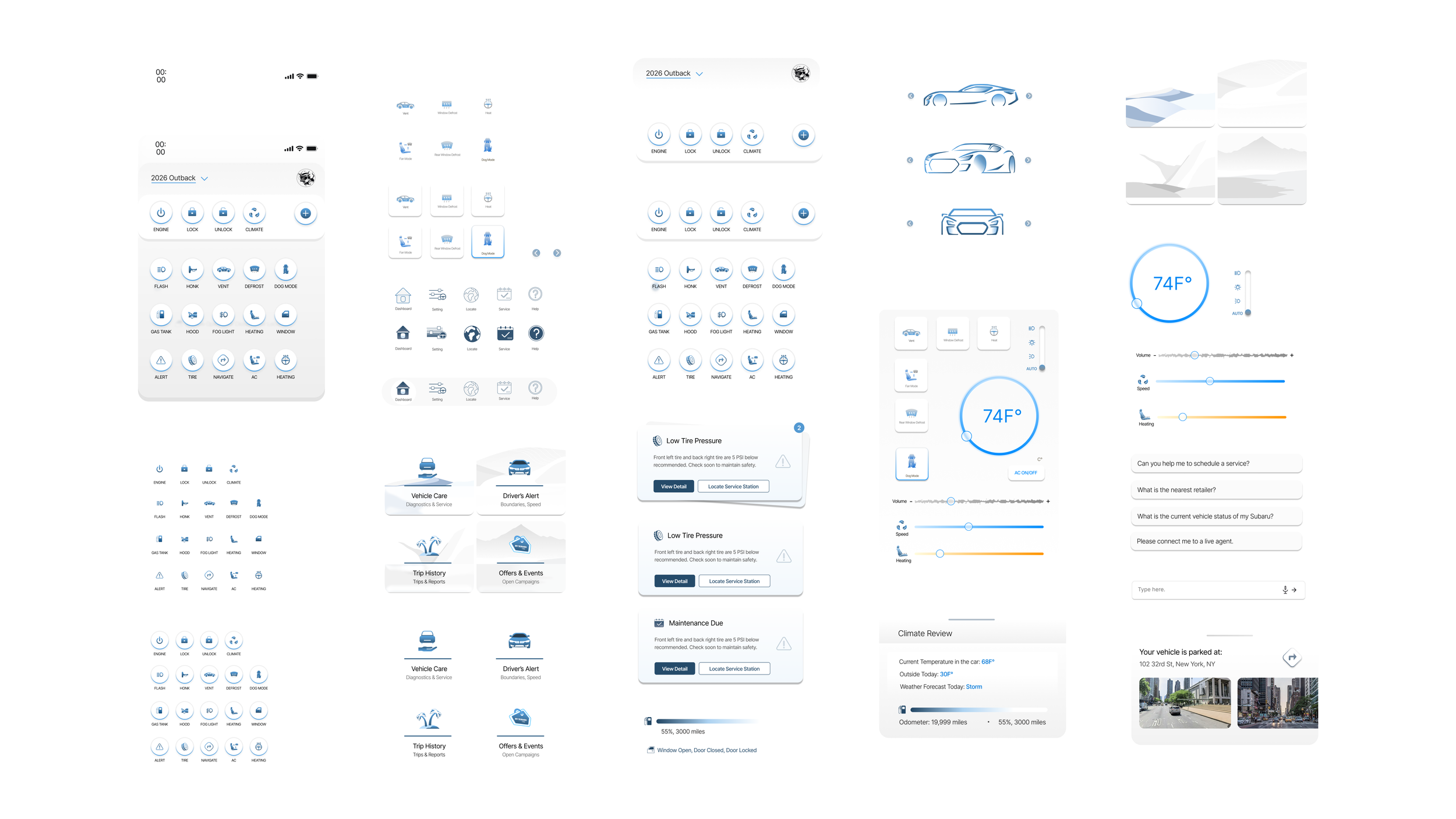
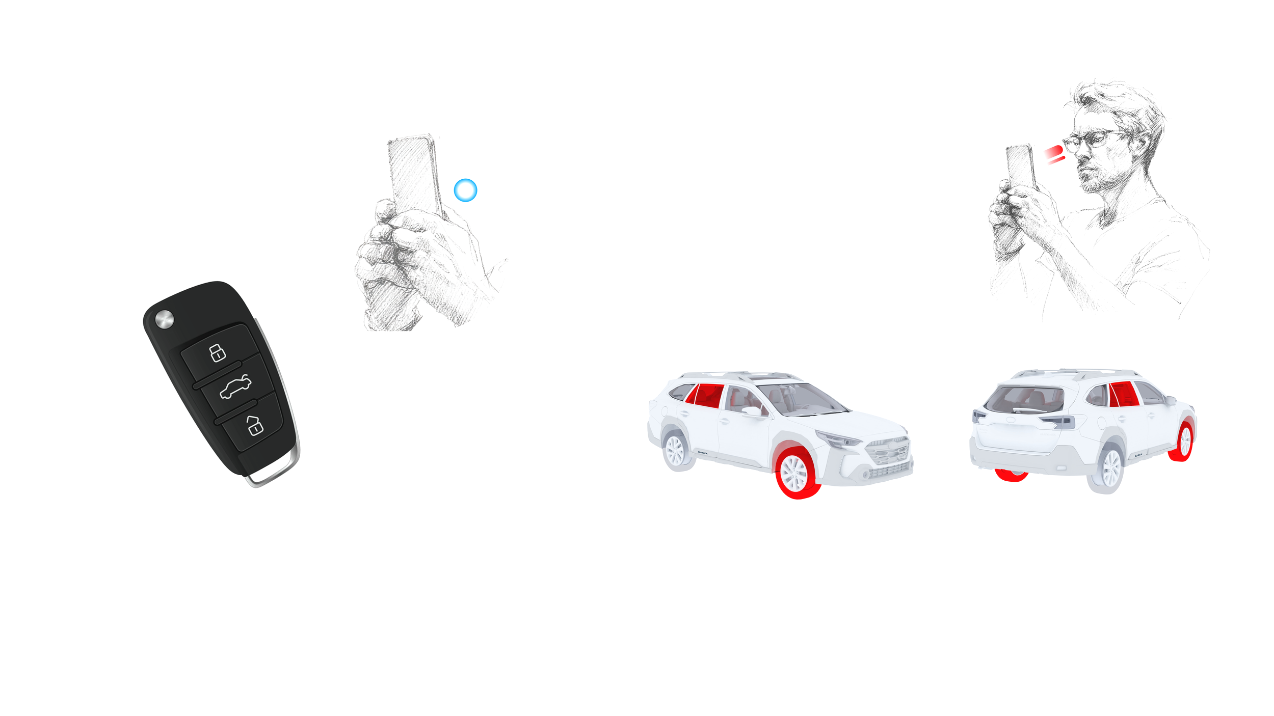
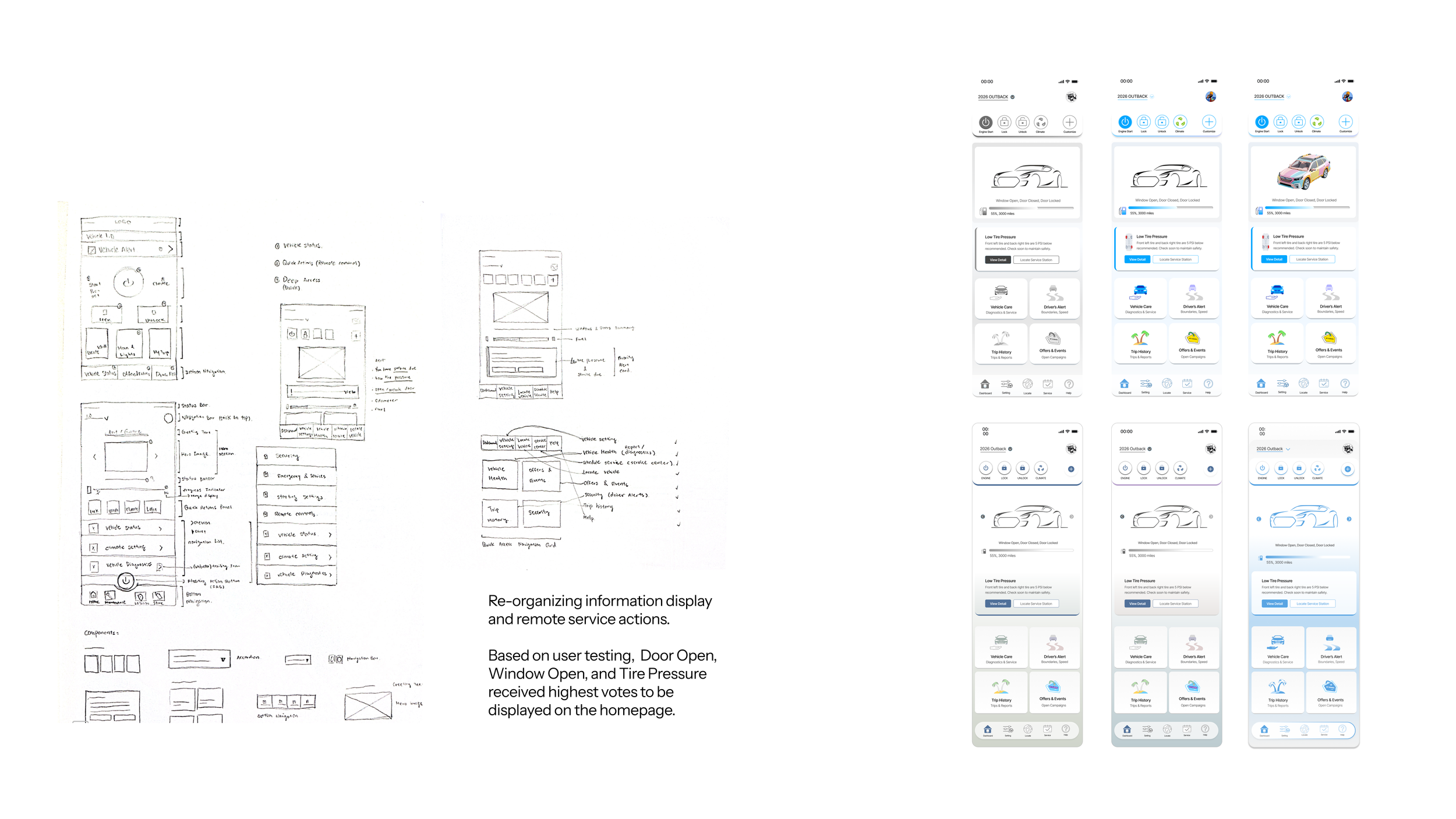
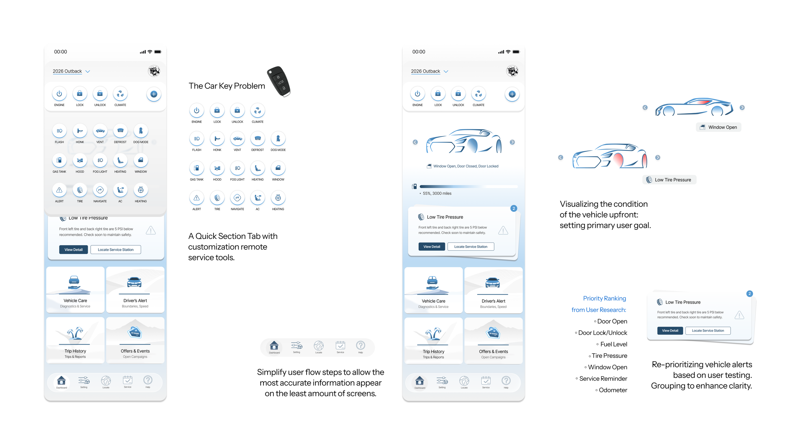
Let’s dive deeper into the solution design. First, for the car key problem, I have created a list of possible commands, that can be expanded by clicking on the plus icon. Users are then able to drag and customize their quick action section.
For the vehicle information display, I’ve created this illustration that can rotate, with immdete display of what is wrong with the vehicle. If vehicle’s tire pressure is low, the tires will be highlighted in red. Window left open? That’s highlighted in red.
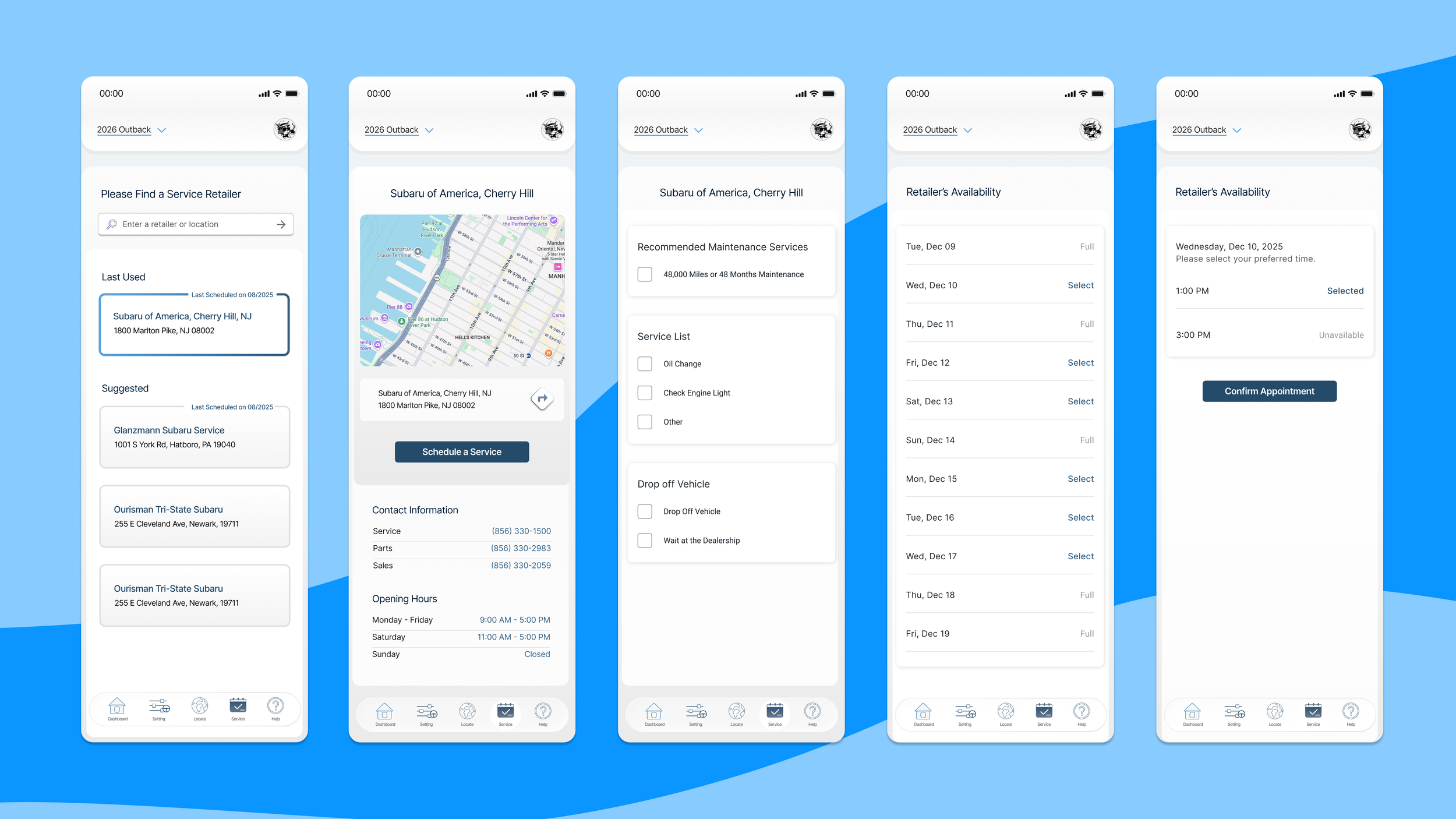
In addition, below the illustration, a pile of cards are available to display alerts. These cards can lead you to quick actions, like navigating you to a service station. The priority of these cards are based on our user testing results, where we asked them specifically which alert users care about the most. The bottom navigation simplifies user flow to control cost.
Design System Define and Expansion