During my tenure at Dentsu, I am embedded at Subaru of America as the only onsite designer, collaborating with a team of UX, UI designers and UX researchers. I led the onboarding redesign for MySubaru Connected Services across mobile app, web, head unit, and watch, facing over 2M users in the US Market. In this case, I will walk you through the MySubaru onboarding redesign.
Context
When I joined SOA headquarter in 2024, the first thing I saw was Change. At a glance, the company is rebranding from the previous STARLINK, to MySubaru. Under this efforts, packages, user paths, expectations are all brought out to be rephrased.
Being the only onsite designer and exposed to multifaceted discussions, I quickly learned that the advanced tier subscription conversion is the Key Goal tied directly to the business profit. It is also the key problem that the company is facing. Sure, the Subaru Digital Companion technology has a solid customer base. Yes, it has a 4.8 customer review. But are values fully realized? The answer is simple - no.
The ongoing change in rebranding does not grow advanced tier conversion onboard, unless key actions are taken to resolve the root problems with this opportunity. I asked my self: Do I adapt to the change, or do I change the change? I decided to go with the latter.

Where are these friction points located along the onboarding and returning journey?
Diagnostics
Awareness → Realization → Adoption → Retention → Advocacy
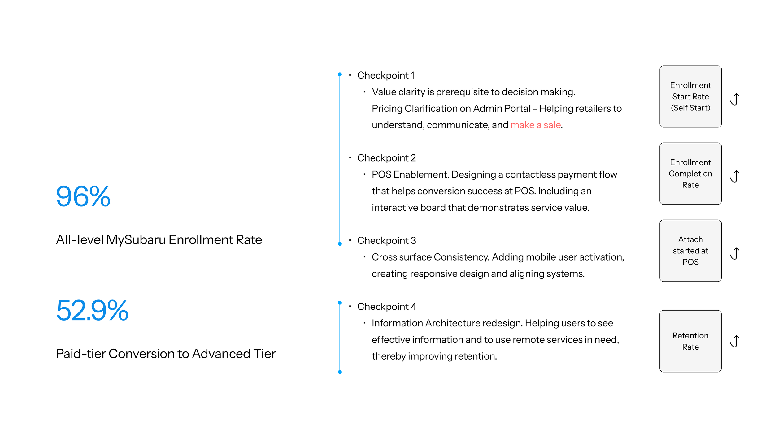
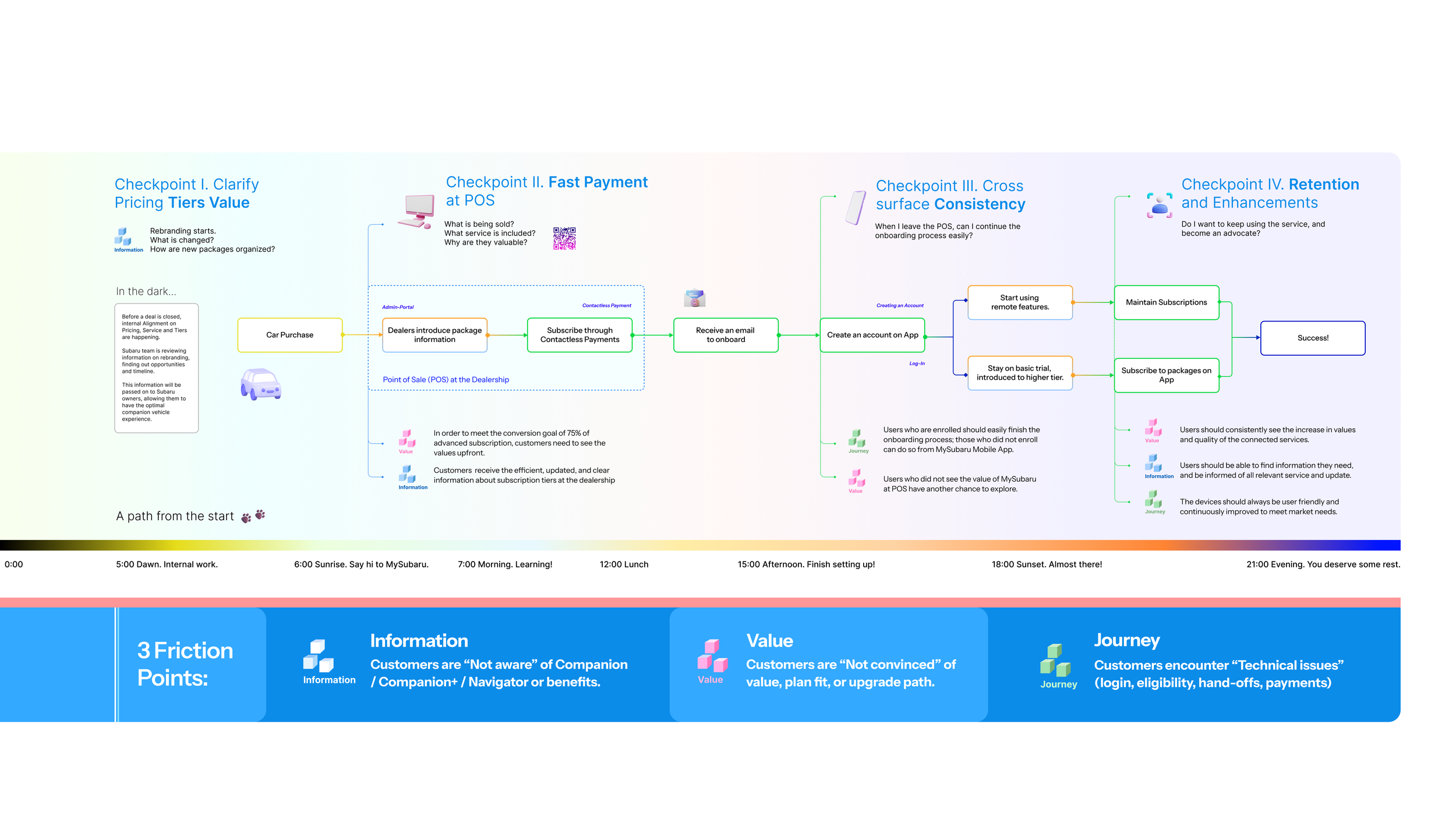
I mapped out the user journey from when Subaru customers first purchase a car, all the way to them signing up to the advanced tier and keep on using the service. On this map, I identified where friction points exist and accumulate. These accumulations give us four key checkpoints that users encounter significant difficulties. The first three checkpoints belong to user onboarding, while the last one belong to user retention, which we will cover in another case.
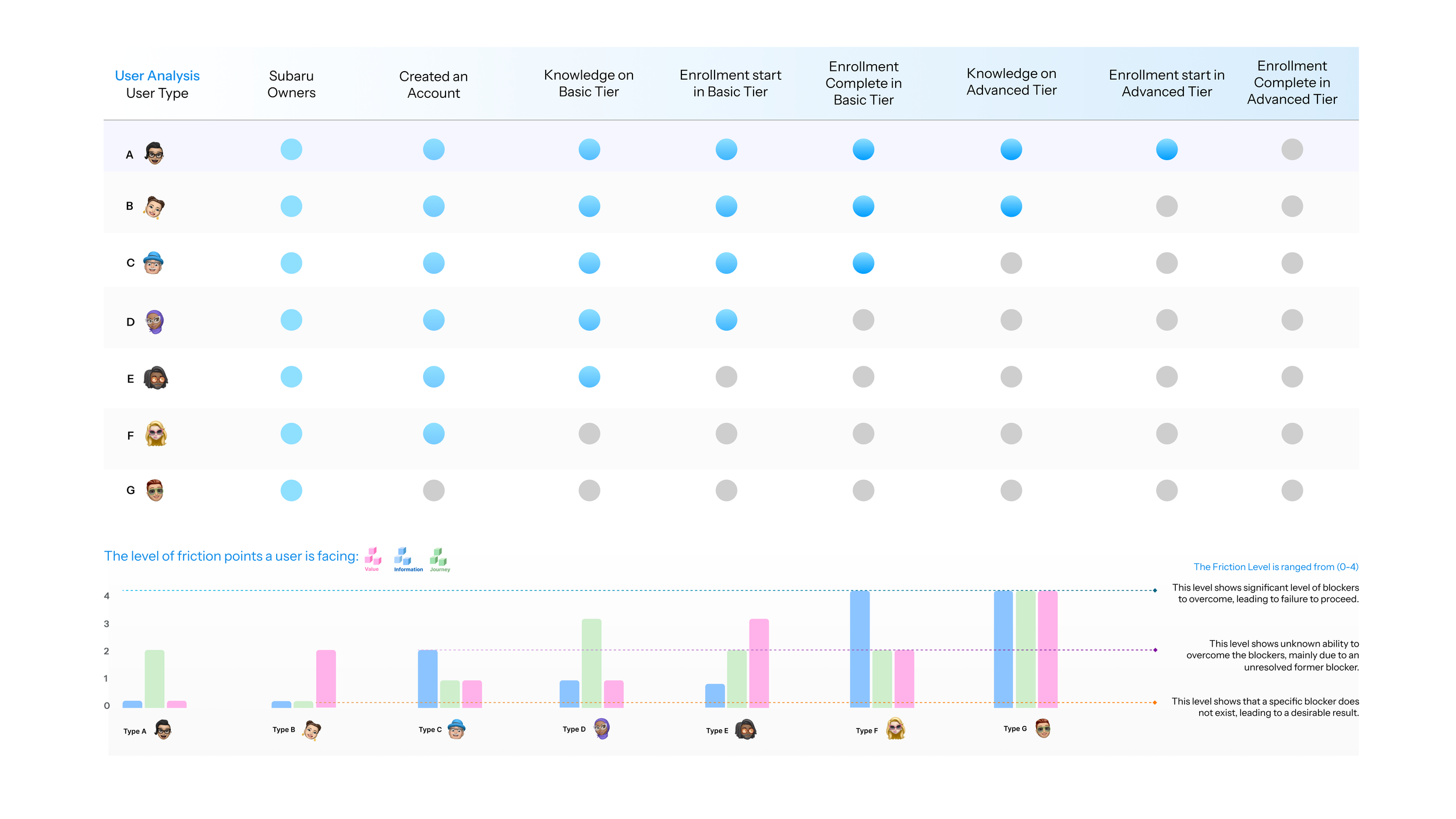
User Profile Analysis
To resolve onboarding difficulties, I’ve first conducted a user Analysis. I summarized 7 user types based on where they are at the on the onboarding journey from purchasing a car, create an account, to enrollment complete in the advanced tier, which is where we want them to be. A blue dot indicates that they completed this step, whereas a grey dot indicates they dropped. This way, we will be able to identify the frictions they are facing, as shown on the bottom chart. For example, if a user have the knowledge on advanced tier, but did not sign up, that means they encounter value friction, because they are not convinced of value that MySubaru has. If a user started the enrollment but did not complete the enrollment, they are facing a journey friction, indicating usability or technical issues; and if a user do not have any knowledge of MySubaru’s service, then they are clearly encountering information friction.
The North Star
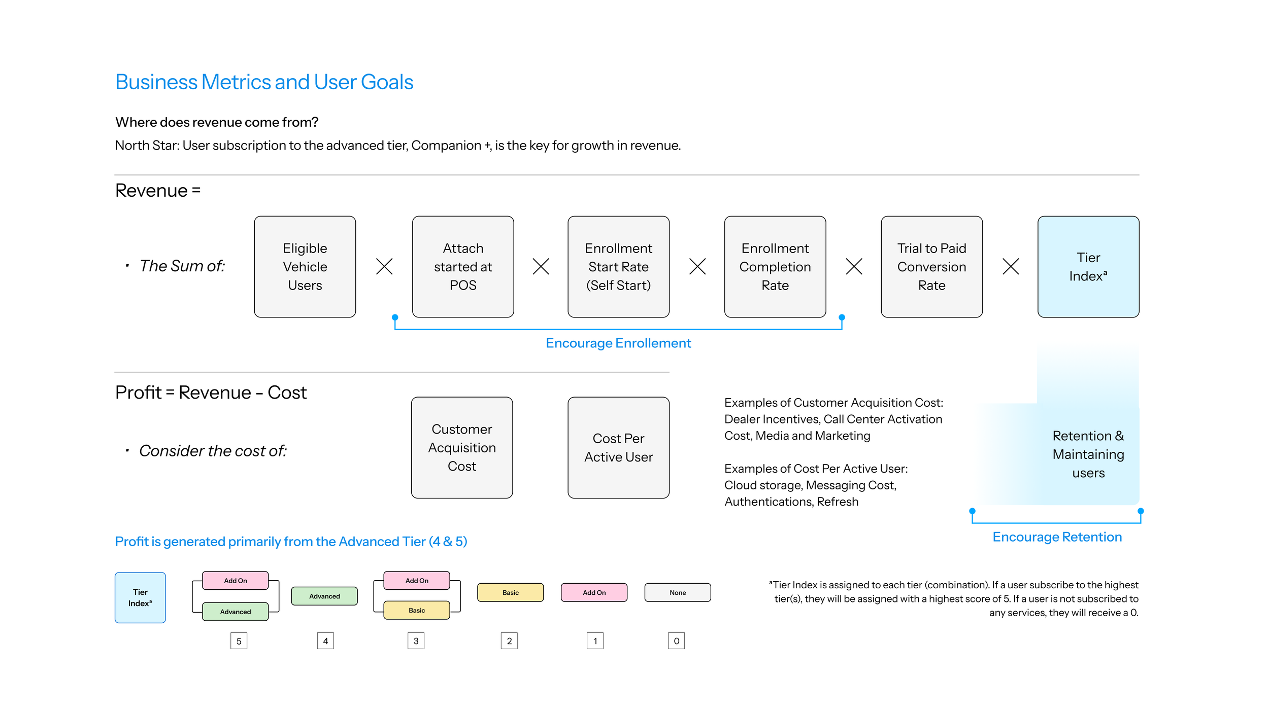
First and foremost, let’s take a look at Subaru Connected Service’s revenue composition. In this onboarding redesign case study, we are mainly looking at attachment rate at POS, Enrollment start rate, and enrollment completion. The equations above shows the role of onboarding within the profitability module. Another notable component here is the Tier index. Subaru Connected service generates profits mainly from the advanced tier, so our goal is to encourage users to enroll in the advanced tier of subscriptions.
Preliminary User Research
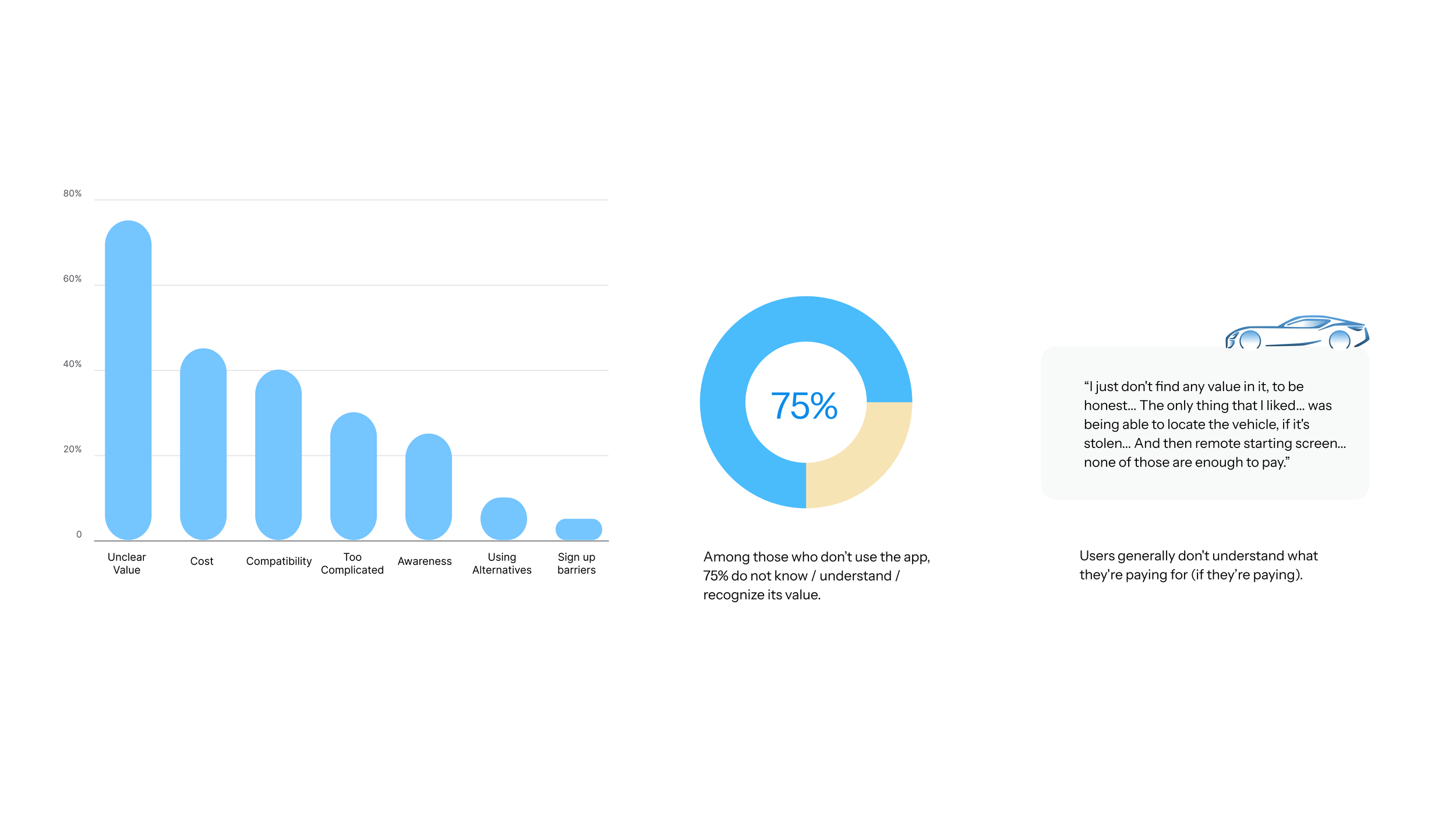
Breaking down the business metrics, we conducted an early discovery stage user research. The research is conducted at a 3-day Subaru’s car owner’s event, as shown in the pictures. The primary goal of the service is to find out key user pain points that users have on MySubaru App.
Among those who don’t use the app, 75% do not know / understand / recognize its value. Users generally don't understand what they're paying for (if they’re paying).
Reasons that users are not using the service include “Unclear value, Cost, Compatibility, seeing it as too complicated, do not have the awareness, are using alternatives, or encountering technical barriers. By categorization, we summarize three key user insights: doubting the value, seeing it as hard to use, and having a knowledge gap.
Prioritization Matrix
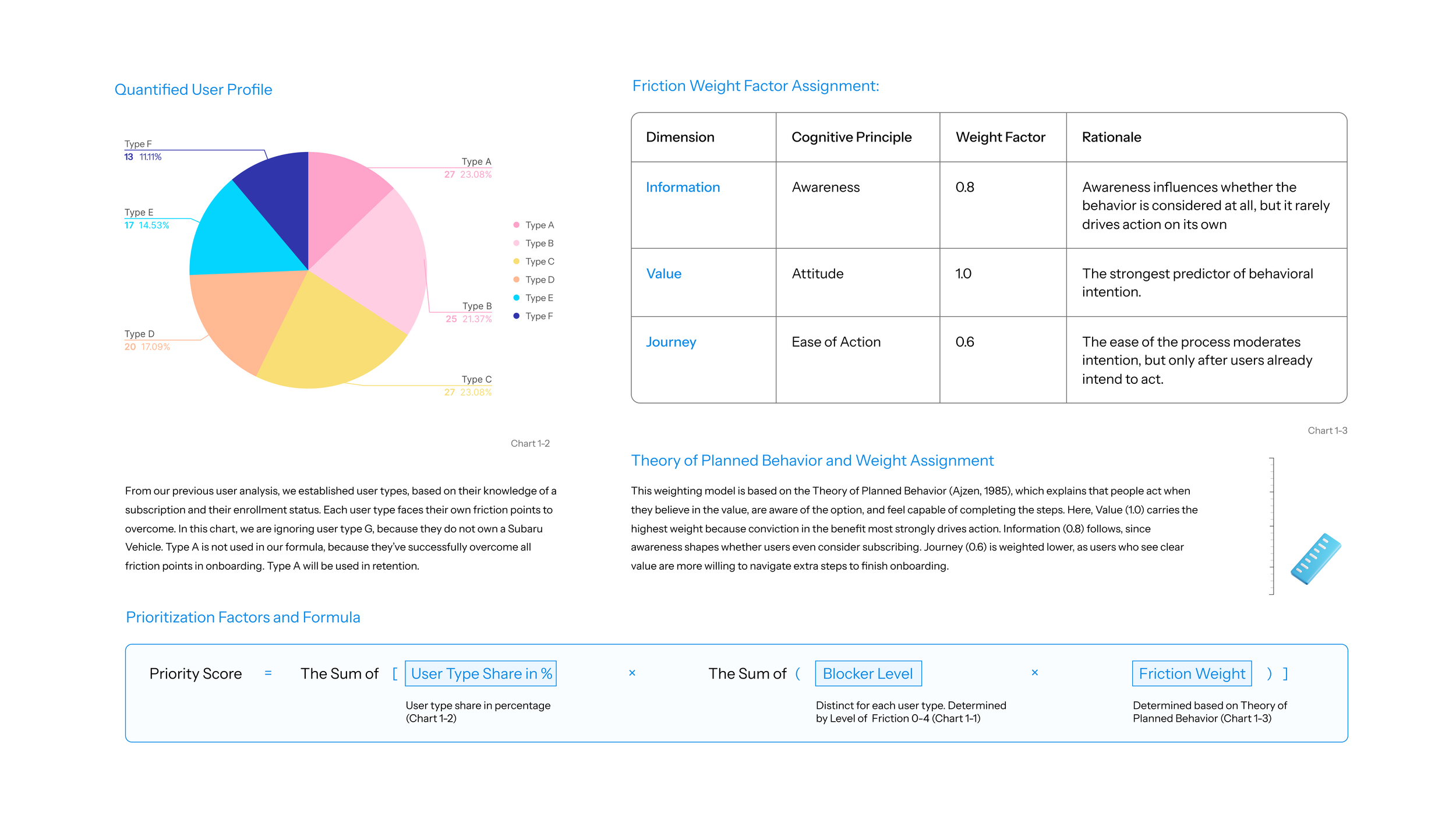
Based on the user type percentage from our survey, and I came up with this prioritization matrix to decide what to work on. In order to sequentialize project on the workflow, I came up with an equation that assigns project a unique priority score, as shown in the box. We already have the User type share in percentage from this pie chart, and blocker level from the previous friction chart. The new thing in this equation is the Friction Weight. Based on Theory of Plan Behavior and our preliminary research result, I assigned weight factor to each of the three friction. Value has the highest weight factor indicating if a user, for example, is convinced of the value, they will be willing to take extra steps to overcome frictions on enrollment journey.
Three Core Checkpoints
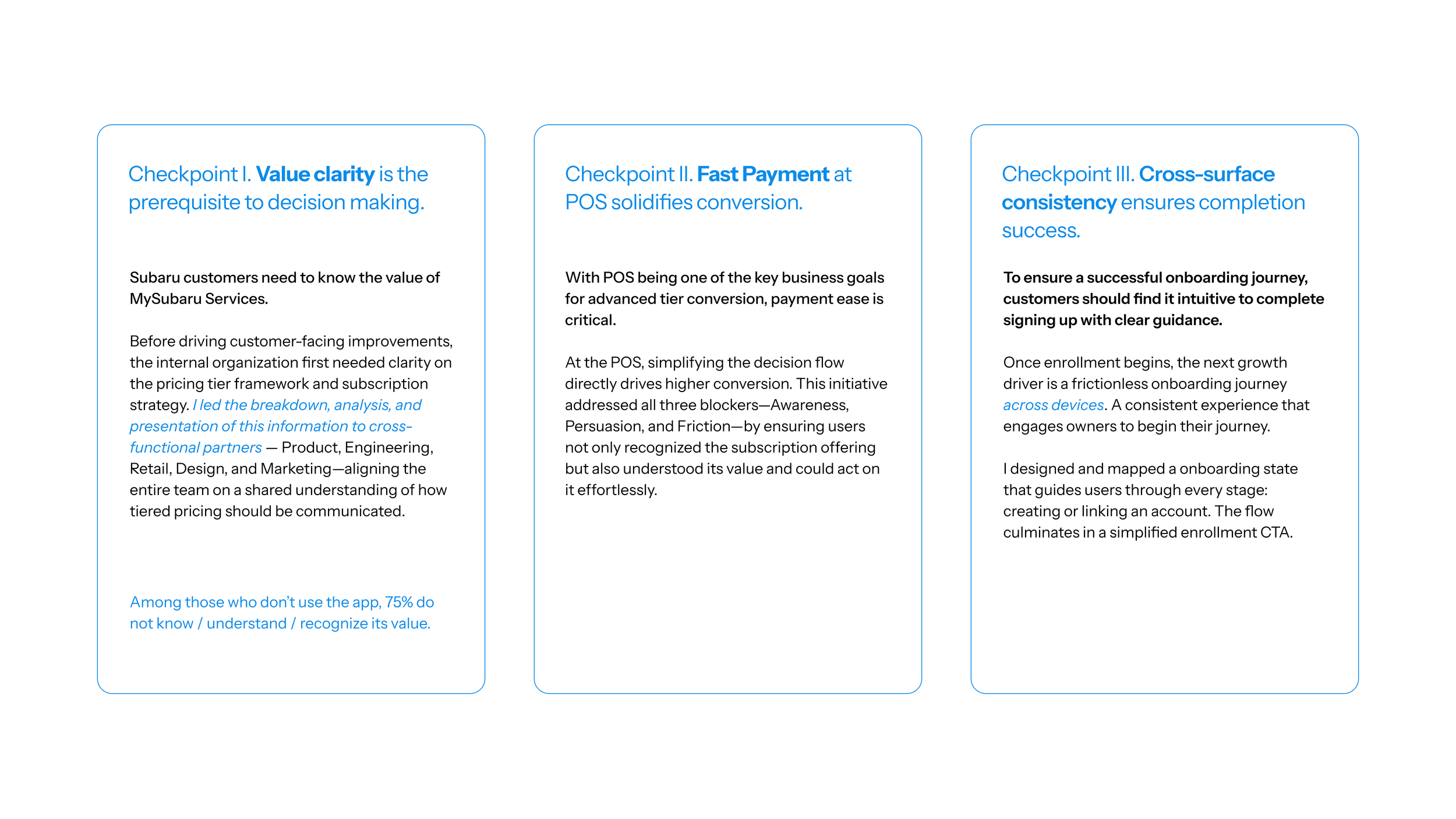
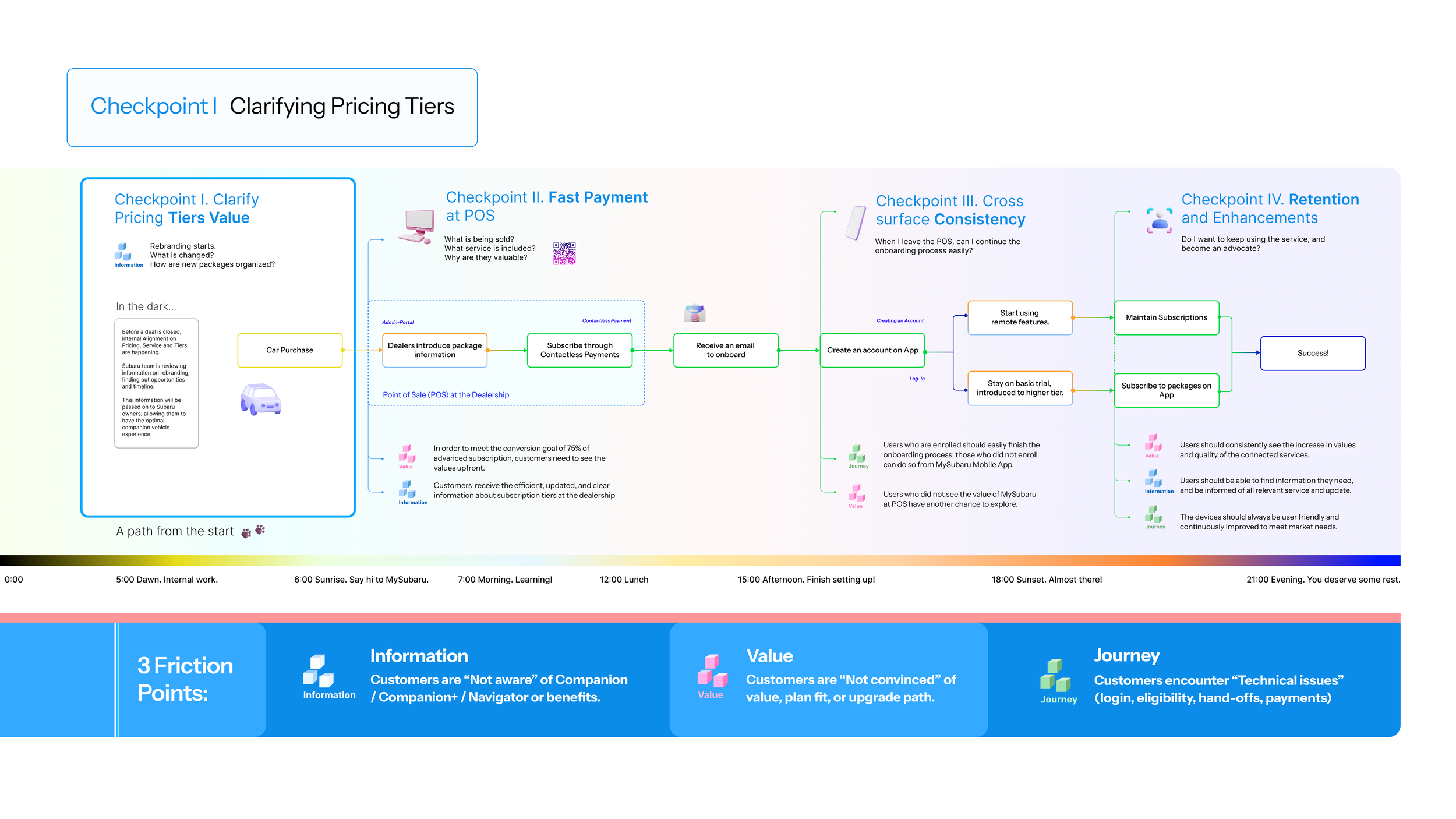
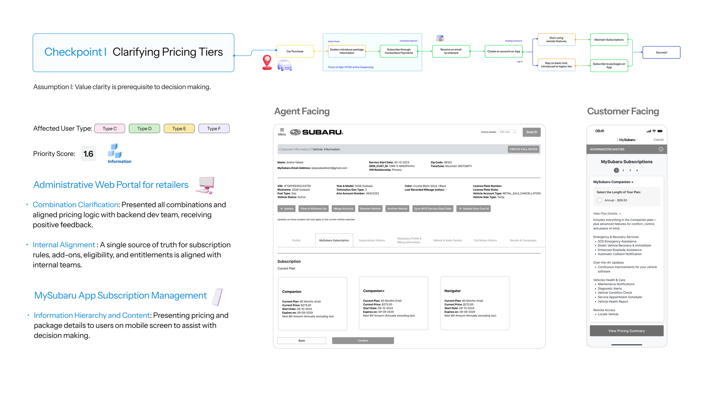
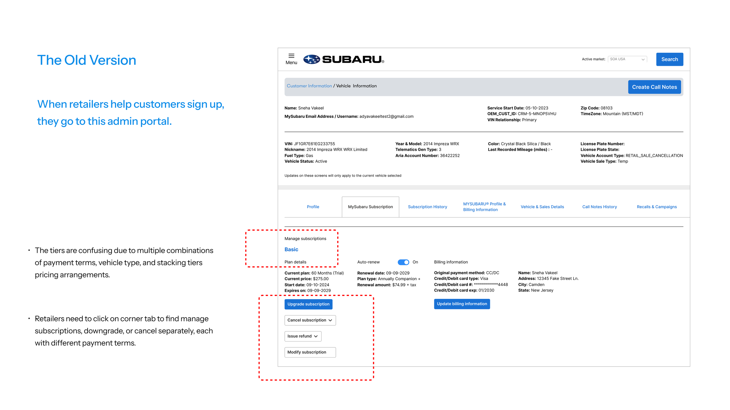
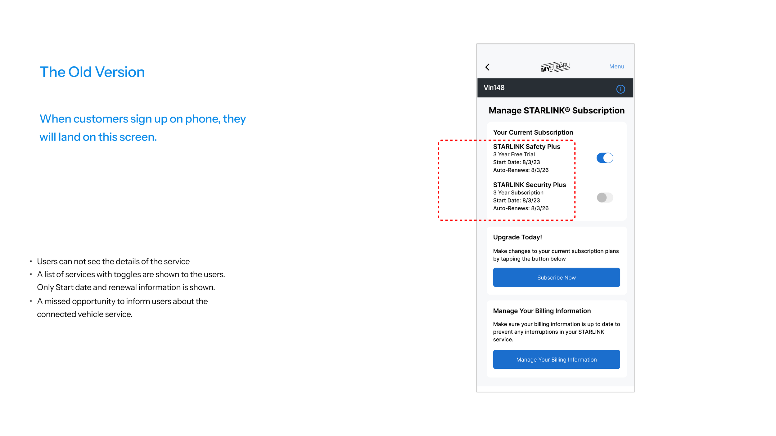
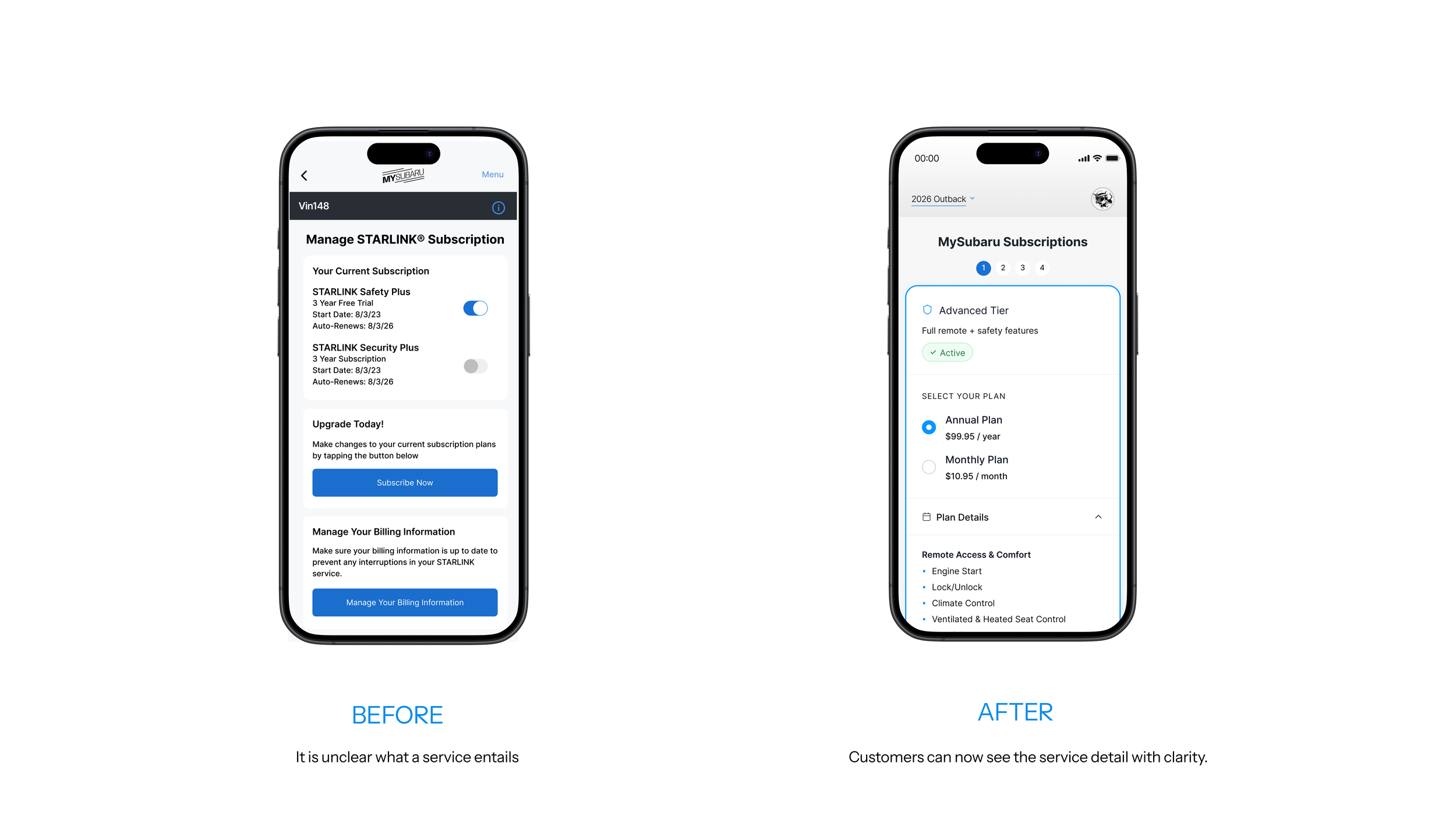
Checkpoint I: Clarifying Tier Values requires internal alignment first, which is shown on the retailer facing admin portal web screen, and then a customer facing Mobile screen.
The problem with retailer facing admin portal is that the tiers are confusing due to multiple combinations of payment terms and stacking tiers pricing arrangements. When retailers help customers to enroll, retailers need to click on corner tab to manage subscriptions which dissolves into multiple flows. The singularity of tier information confuses retailers as the combinations are not clear.
On the customer’s end, they can see what options they have, but they don’t know what these options mean. The missed opportunity here is to give exposure of the wonder services to the users.
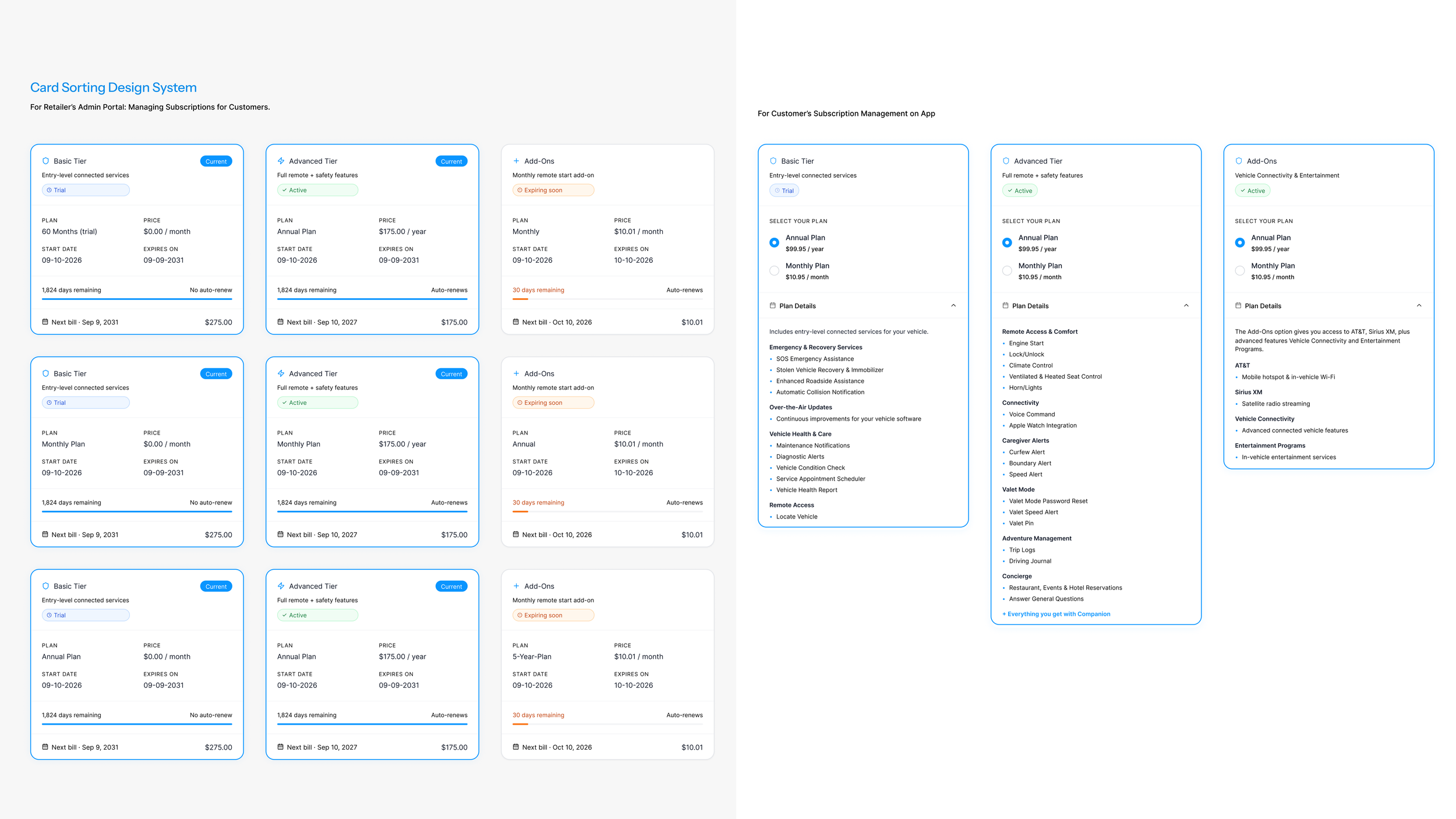
In order to tackle this tier confusion. I listed all the possible combination a user can subscribe to, and organized them on cards. This card sorting system is then transferred to mobile devices, to resolve the service clarity issue.
On the retailer’s end, relevant cards will be shown. Retailers can select and deselect tier to enroll or modify in the future, with payment terms and expiration dates. The user flow is simplified from multiple to one.
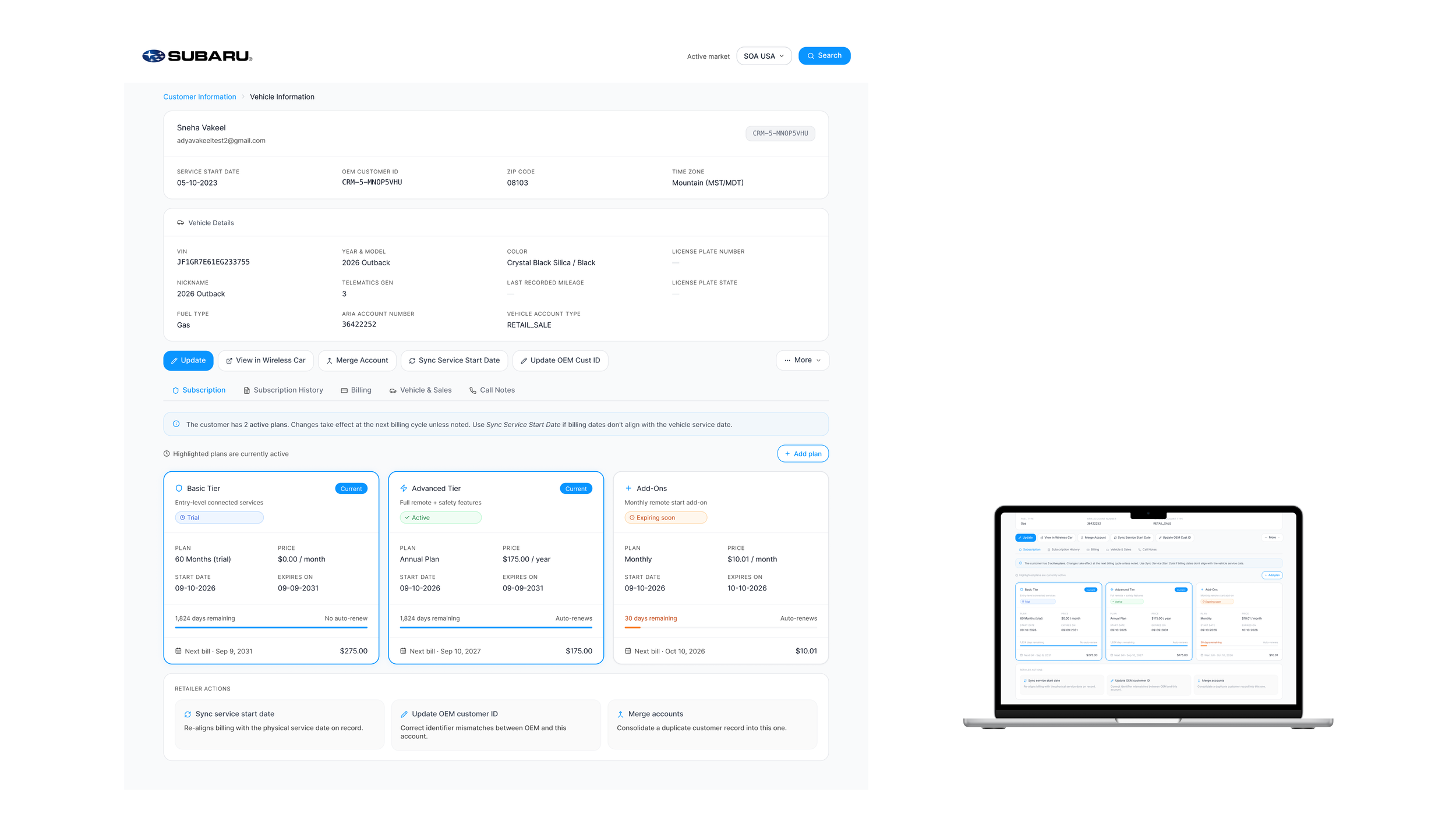
On the customer’s end, users are now able to view the details of each tier. What services are included, and what payment terms do I want to select - These information is now readily available.
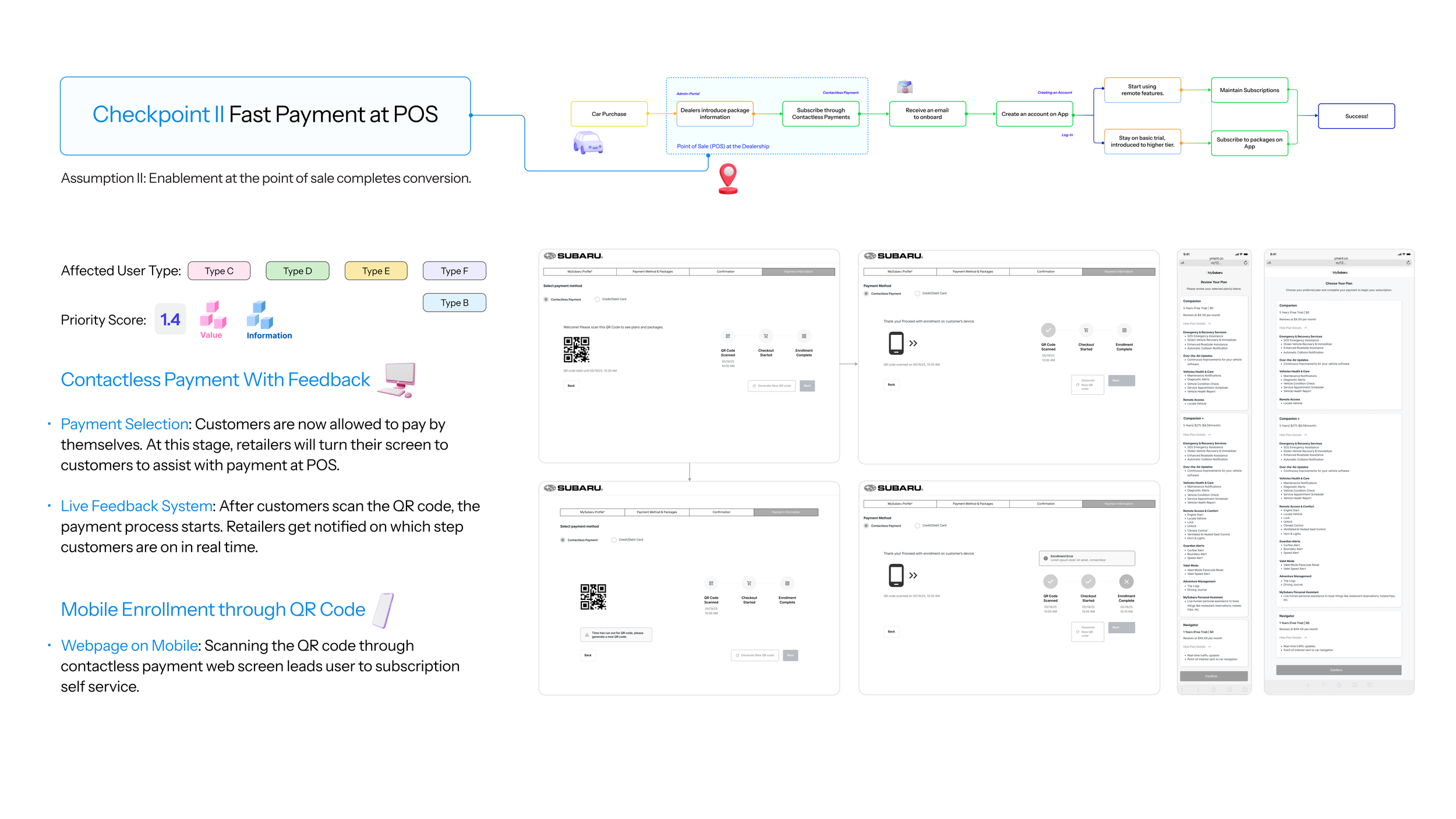
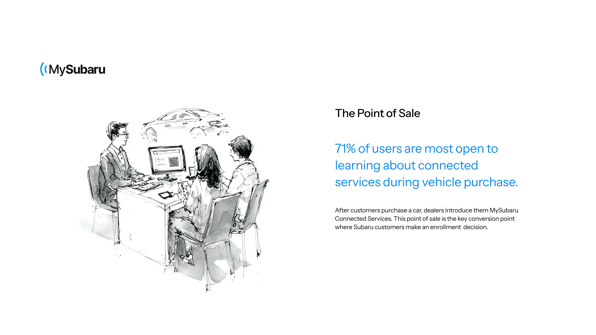
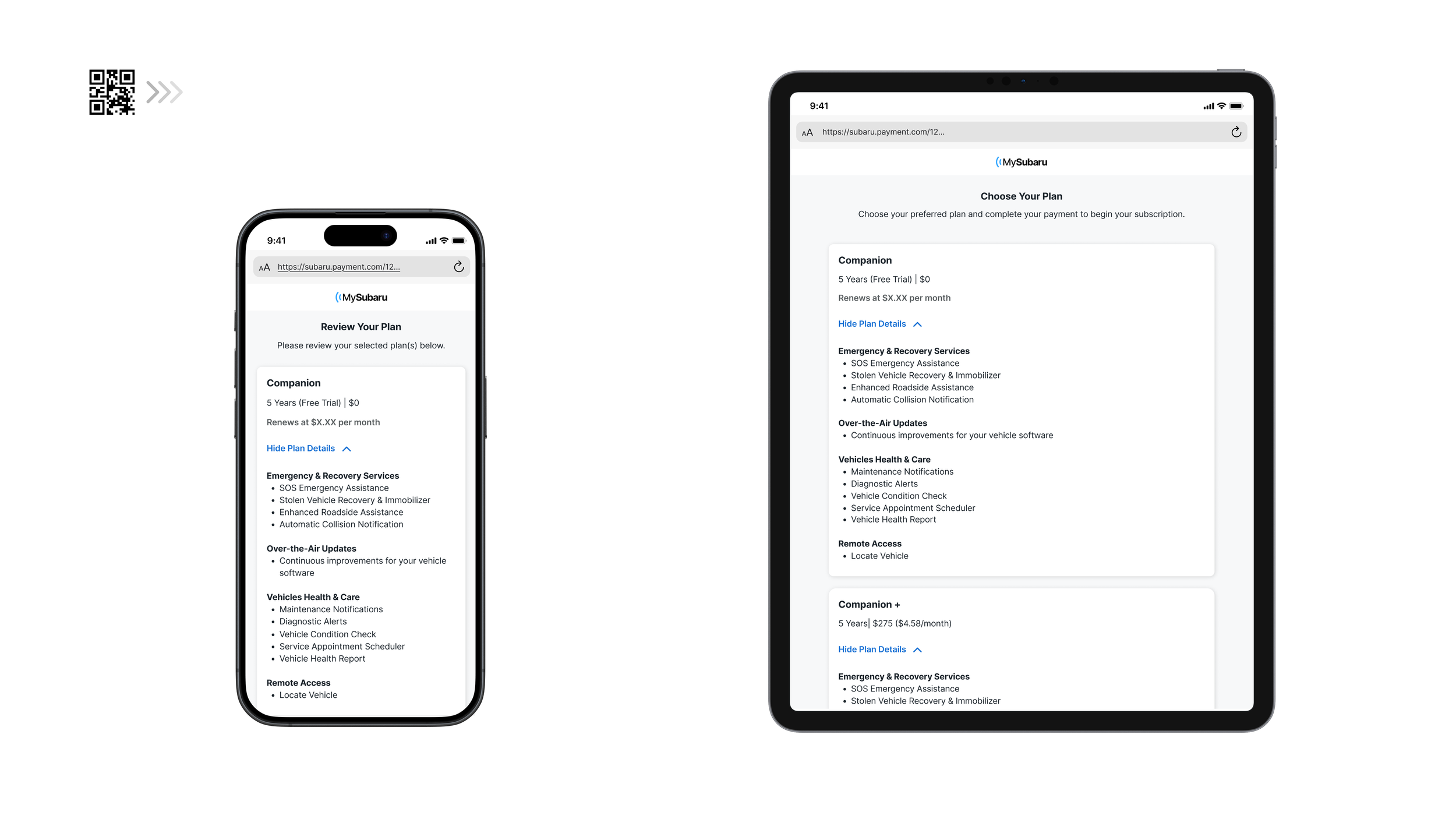
Checkpoint II: Fast payment at POS completes conversion. Similarly, this solution also incorporates web and mobile facing both retailers and customers. We added a QR code for users to scan and complete contactless payment. After scanning, customers arrive at a service selection page on their browsers.
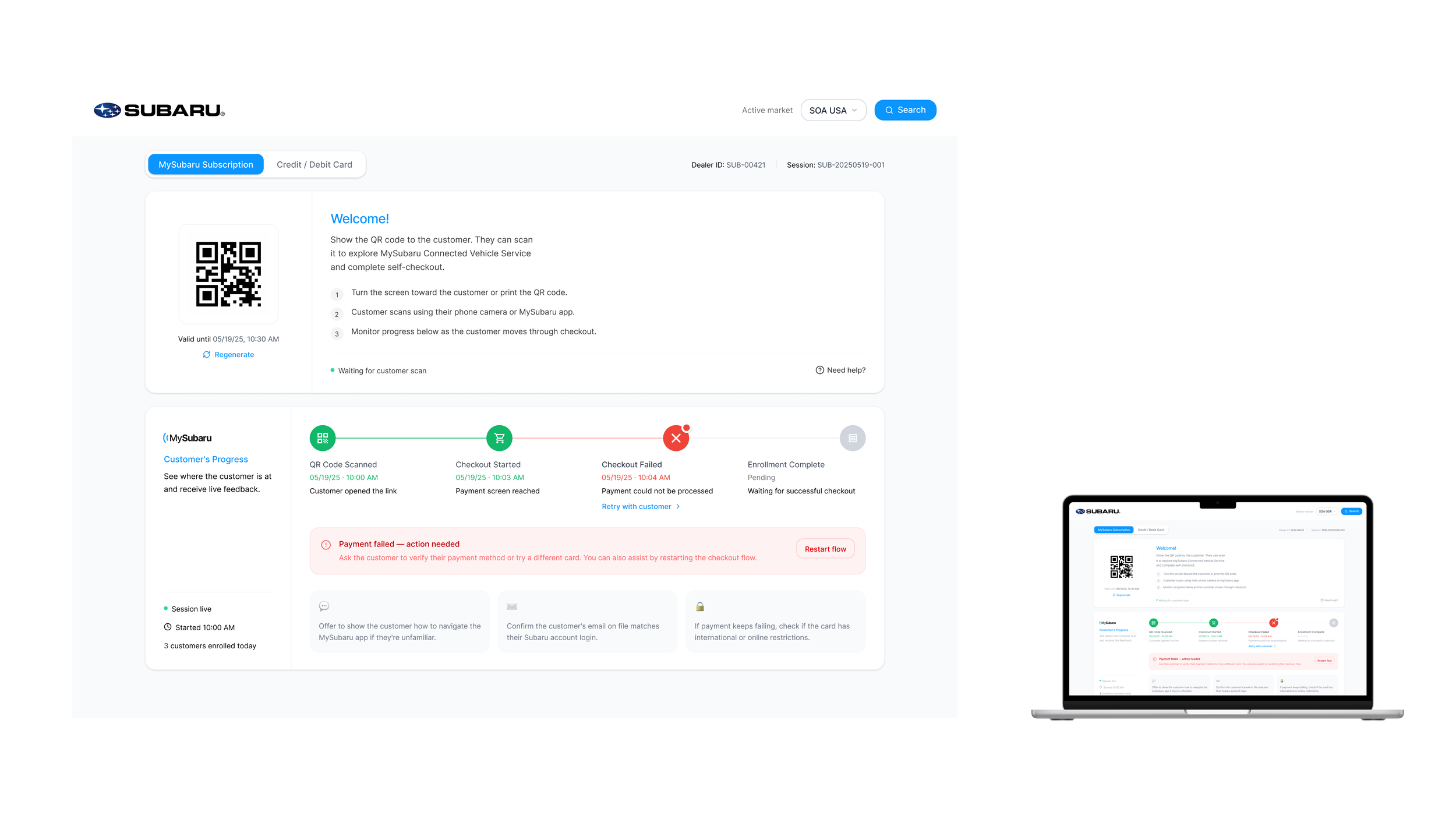
On the customer’s end, the QR code opens up to a subscription selection page, where again, incorporating the tier clarity solution, they will be able to learn about the service and make a decision on their own.
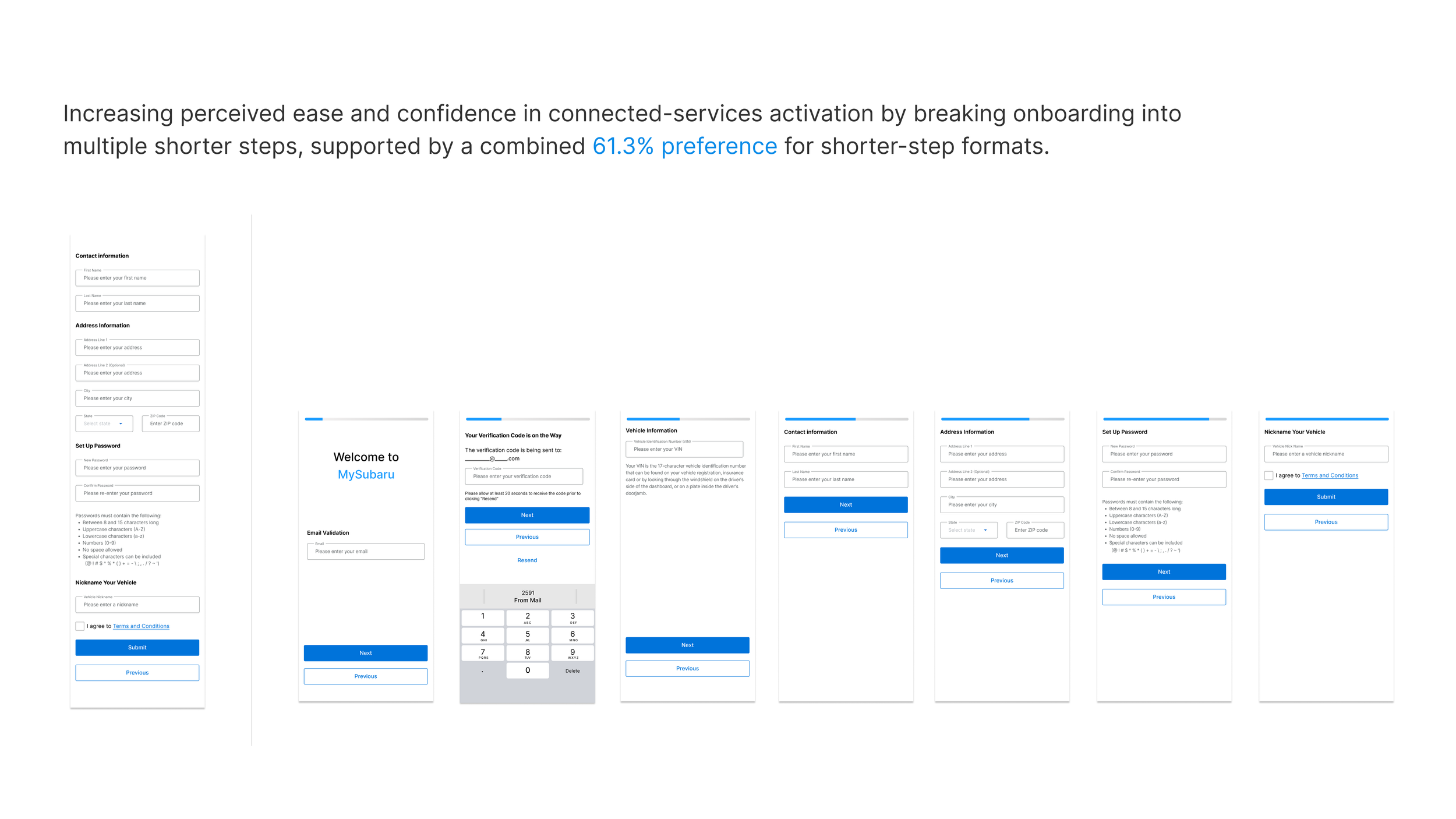
Checkpoint III: To ensure a successful onboarding journey, customers should find it intuitive to complete signing up with clear guidance. What happens after customers pay at point of sale? They receive an email that leads them to download MySubaru Mobile App. However, the old App does not have creating an account feature. Users have to go to the website to complete enrollment. To resolve this, we proposed an account creation journey once they download MySubaru.
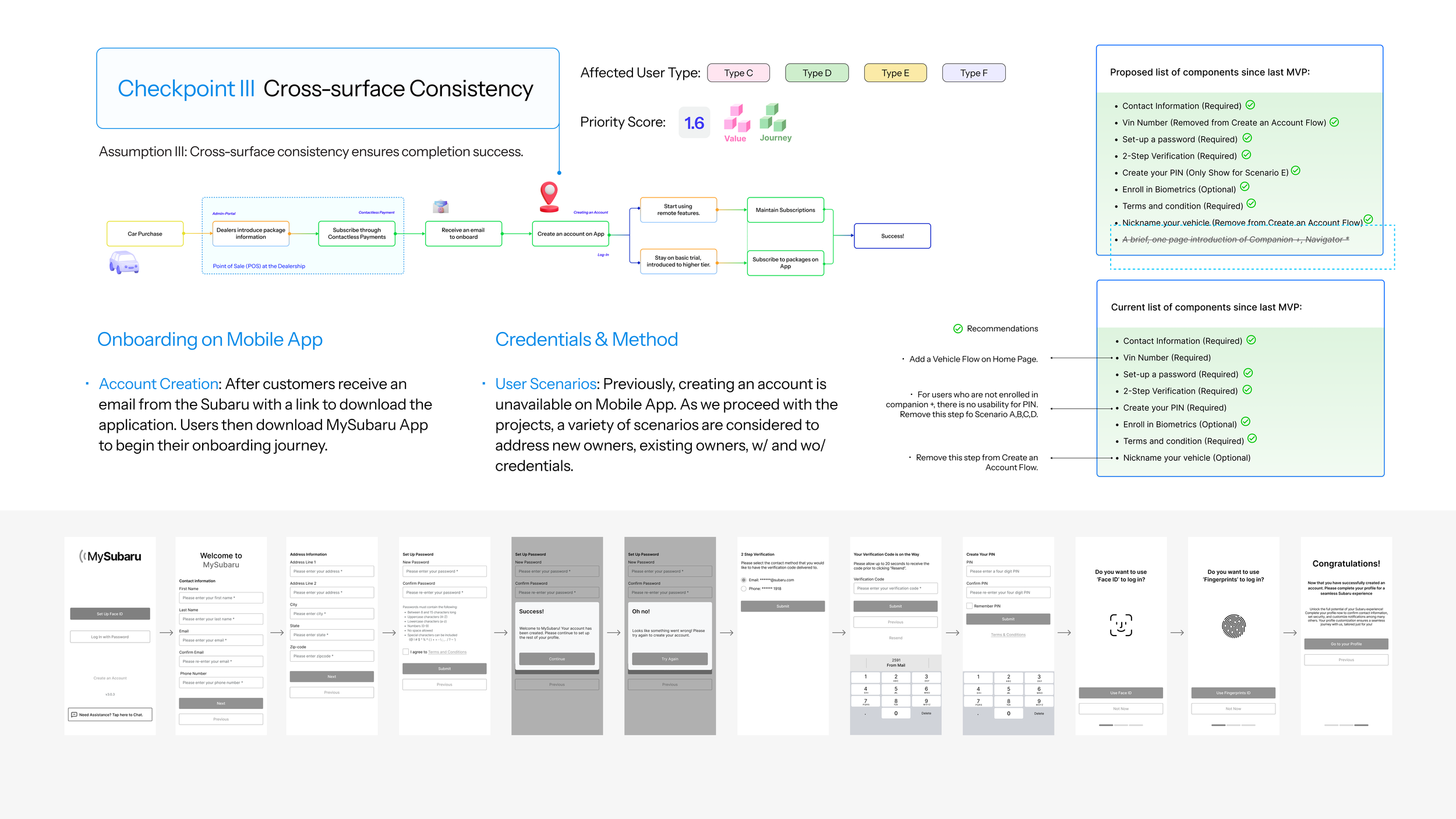
This is the account creation journey. Users select create an account, complete three required step to enter information, which will link them with their existing setup at the dealership. We have skipped the PIN and biometrics enrollment to simplify the sign up journey. Once that’s completed, users are all set.
Outcome